Digital Intake
Typography
About the project
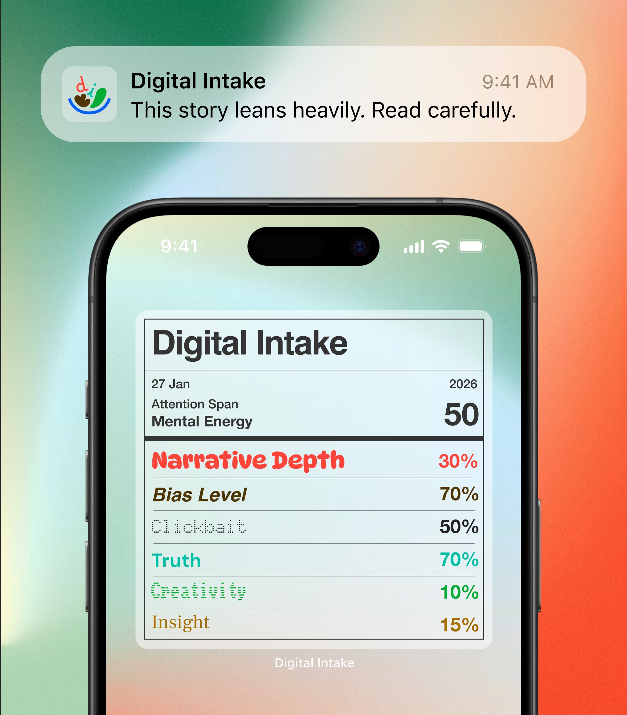
Digital Intake reframes reading as a visual experience. A typographic lens to see and feel, the truth inside your daily digital diet.
Client
Monotype & Penguin Books
Services
Typography
Year
2026
About the project
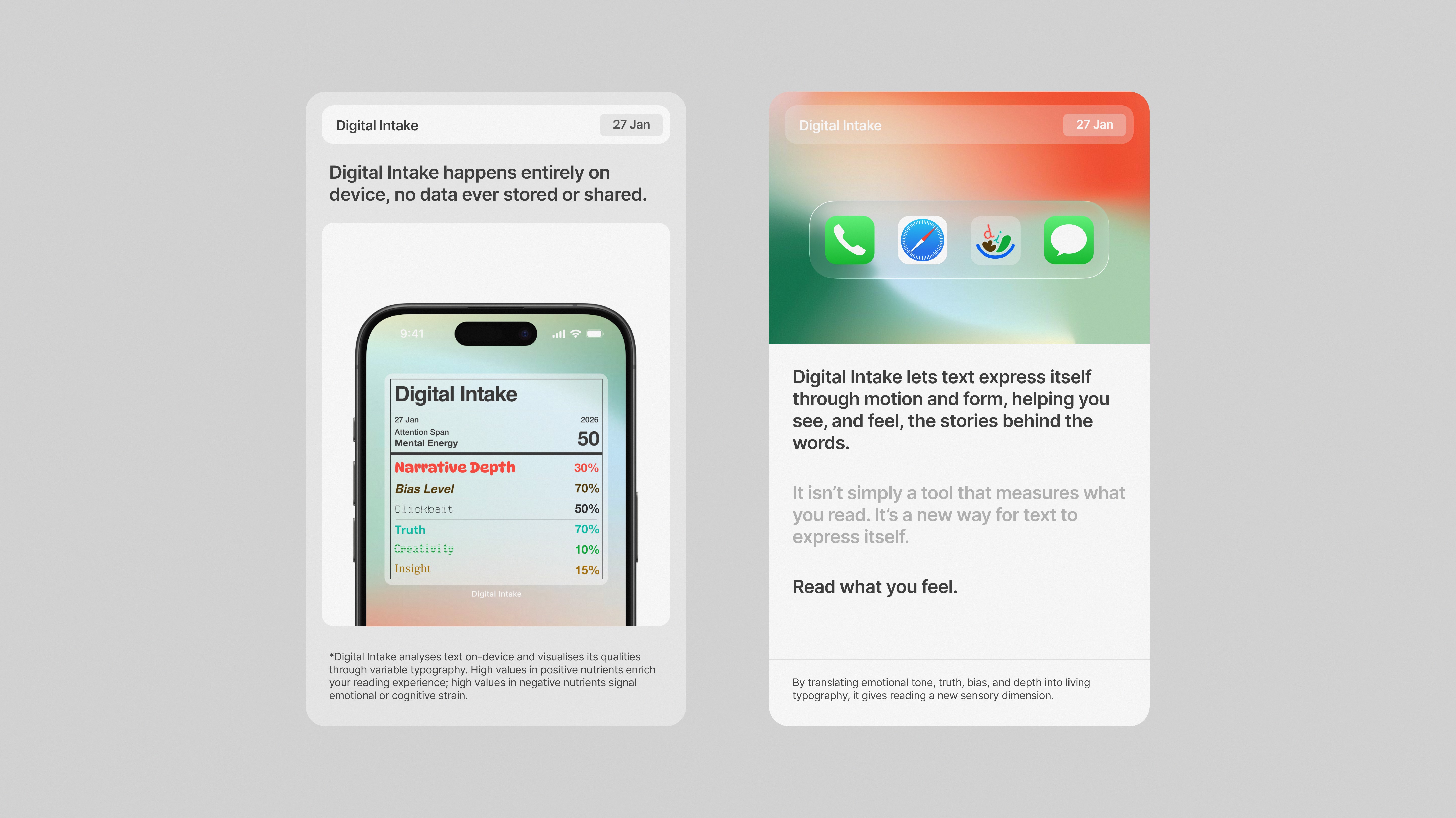
Digital Intake reframes reading as a visual experience. A typographic lens to see and feel, the truth inside your daily digital diet.
Client
Monotype & Penguin Books
Services
Typography
Year
2026
Challenge
In a digital environment saturated with content, users consume information rapidly without recognising its emotional or cognitive impact. There is no intuitive system to evaluate the “quality” of what we read.
Strategy
Reframe digital content consumption as a form of intake, similar to nutrition. Develop a system that translates invisible qualities (bias, insight, creativity) into measurable, immediate feedback.
Identity
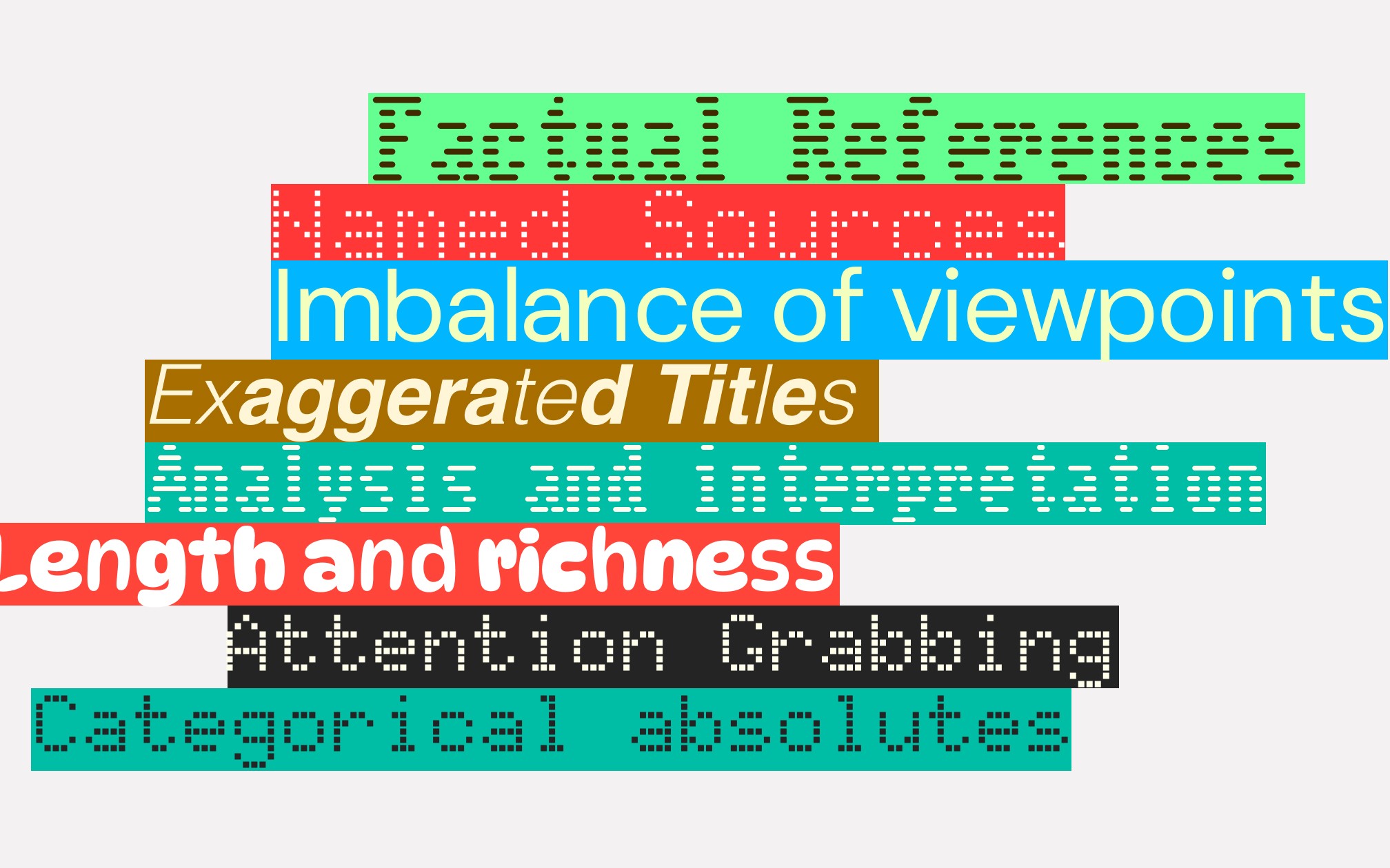
A variable typographic system where type visually reacts to content. Distortions, weight shifts, and structure act as signals—turning text into an expressive layer that communicates meaning beyond words.
Application
A mobile widget and interface that scans content in real time and displays a “digital nutrition label,” providing users with instant feedback across platforms such as social media and messaging apps.
Outcome
A speculative design framework that bridges reading and feeling—using typography as a sensory tool to increase awareness, encourage critical consumption, and redefine how users engage with digital information.
Challenge
Traditional stained glass functioned as a public communication system, yet its role has diminished in contemporary society.
The challenge was to reinterpret its structural and visual logic for today’s screen-based environments without reducing it to decoration.
Strategy
Extract the core principles of stained glass (grid, light, and colour) and translate them into a systematic framework for digital interfaces.
Identity
A modular typographic system built on grid divisions, where colour and light behave as carriers of information. The identity balances clarity and expression, using structure to organise content and colour to signal meaning.
Application
Applied across screen-based contexts such as public displays, interfaces, and information systems.
Outcome
A contemporary visual language that repositions stained glass as a relevant communication model.
The project demonstrates how historical visual systems can inform future-facing digital interfaces.
Challenge
The task was to transmediate Jean Rhys's 1962 short story into a new medium without losing its psychological depth. The primary challenge was to move beyond the "book" format and find a visual language that could articulate Selina's struggle against the rigid social and legal systems of 1950s London.
Strategy
I re-imagined the story as a commemorative vinyl record box set. This medium acts as a metaphor for the story's climax: the theft of a private, soulful melody and its conversion into a commercialised jazz record. The strategy was to use two contrasting visual languages - one representing Selina's internal emotional journey and the other representing the external, oppressive system.
Identity
The first vinyl was developed by a series of logos I created based on 1950s London visual archives. Each logo repersents a specific location Selina navigated. The second identity symbolises the power dynamics and the business-driven theft of her identity.
Application
These identities were applied to two separate vinyl packages, representing her chronological movement through the city and the commercial locking of her voice.
Outcome
The final outcome exposes how the city of London functioned as a machine for commodification. By visualising specific locations with branded logos and lines, it reveals a narrative of systemic isolation and the loss of a private soul.
Challenge
Loneliness among young adults is increasing, despite living in densely populated cities. Existing urban spaces often prioritise productivity or consumption, leaving little room for unstructured, inclusive connection.
Strategy
The strategy focused on creating a community-owned third space that allows people to participate at their own pace, balancing belonging and individuality. The project combines research into loneliness, community ownership, and inclusive design to propose an alternative to capitalist, exclusionary social spaces.
Identity
Hand-drawn, playful forms reflecting different social energies were used to communicate emotional safety and approachability. Rather than a fixed logo, a flexible visual language allows SPACE to feel personal, community-led, and adaptable to different users and activities.
Application
The identity was applied across branding, spatial design, signage, activities, and communication materials. SPACE functions as a physical venue, a community initiative, and a brand system.
Outcome
SPACE proposes a scalable model for community-owned, inclusive third spaces that foster belonging and un-loneliness. The project demonstrates how design can respond to social isolation through environment, identity, and participation, offering a sustainable alternative to capitalised spaces.
Challenge
Just One Building is a lecture series exploring adaptive reuse, but it lacked a distinctive visual identity that could stand out in both physical architectural spaces and digital platforms. The challenge was to create a system that felt architectural, contemporary, and recognisable.
Strategy
The strategy was to build a modular identity system inspired by architectural construction and reuse. The brand needed to function like a kit of parts -scalable, repeatable, and adaptable.
Identity
I translated the core concept of adaptive reuse—layering new functions onto old structures—into a graphic system. The isometric grid represents the existing architectural structure, while the colourful blocks symbolize Manchester Buildings and the School of Architecture.
Application
The system was applied across lecture room posters, digital screens, and social media assets. The modular forms adapt to different formats, from civic architecture to online promotion.
Outcome
The project resulted in a strong and flexible visual identity that clearly represents the lecture series. The system increased recognition, supported event promotion, and positioned Just One Building as a confident, contemporary lecture series for architectural discussion.
Challenge
A 10 months project. Weedool was originally used as a clinical digital treatment tool in hospitals. As the Behavioural Activation service expanded to students, the brand felt too medical and formal. The challenge was to modernise the identity and create a friendlier, more approachable experience without losing trust or structure.
Strategy
Our focus was repositioning Weedool from a treatment tool to a daily wellbeing companion. The focus was on making behaviour tasks fun, celebrating small progress using warmth and motivating reward game system.
Identity
The new identity uses bright blue, fun icons, and simple typography to reduce pressure and feel more human. A mascot system was introduced to add personality and emotional connection, helping users feel encouraged rather than monitored.
Application
The refreshed brand was applied across the app icon, UI, mascot interactions, and visual assets. The system was designed to be flexible, working in both wellbeing and non-clinical contexts.
Outcome
The rebrand successfully transformed Weedool into a modern, friendly wellbeing app that connects better with students while remaining reliable and structured.
Challenge
The rapid globalisation of Korean culture and the dominance of K-pop have caused traditional street sounds to fade from the public consciousness. As these auditory markers of heritage disappear, there is an urgent need to document and preserve the "miscellaneous" sounds that defined the rhythm of daily life for previous generations.
Strategy
By using the visual language of Dancheong as a protective metaphor, the project creates a bridge between tangible art and intangible sound. The strategy involves archiving field recordings of traditional life and pairing them with specific geometric patterns to create a multi-sensory experience.
Identity
The identity of the project is rooted in the contrast between the vibrant, structured beauty of Korean decorative art and the fluid, ephemeral nature of sound. It positions Dancheong not just as a historical aesthetic, but as a living "sonic archive" that safeguards the soul of South Korea’s traditional soundscape.
Application
The archive is applied through a physical publication and digital website format, promoted through motion graphic.
Outcome
The final outcome is a comprehensive digital and physical repository that preserves childhood memories and cultural heritage for a global audience. The project ensures that Korea’s traditional sonic identity remains a vibrant part of its modern cultural narrative.